Furniture Flow
Designing a campus-centered resale & delivery platform for urban students.
Role
Product Manager & Product Designer (solo)
Timeline
Academic term project
Focus
Product conception, marketplace interfaces, design systems
Context
Furniture Flow is a mobile app concept designed to help college students in the NYC area buy, sell, and move secondhand furniture. The platform combines resale, discovery, and optional delivery or short-term storage into a single student-verified marketplace.
This project was developed as part of a course on technological innovation. The goal wasn’t to build a full product, but to translate an idea into a feasible MVP — as a designer, I used the opportunity to try out making and implementing a basic design system, map user motivations, and come to interface decisions on my own.
Problem Space
College students frequently resell furniture during move-in, move-out, and housing transitions. Through initial research and observation, a few pain points showed up repeatedly:
- Listings are scattered across platforms like Facebook Marketplace, Craigslist, and group chats
- Transactions require manual coordination for pickup, transport, and timing
- Trust is inconsistent, especially in dense urban environments
- Delivery and temporary storage are difficult to arrange independently
In NYC, these issues are amplified by limited access to cars, small living spaces, and fast housing turnover.
Research & Inspiration
Before designing, I referenced existing marketplace platforms — especially Facebook Marketplace and Depop — to study patterns around listing, browsing, and trust.
Facebook Marketplace highlighted the importance of local context and real identities, but also exposed friction around coordination and logistics.
Depop showed how visual-first browsing and lightweight categorization can make resale feel engaging and less transactional.
Rather than copying features directly, I focused on understanding why certain patterns worked — and where they broke down for furniture-specific use cases.
Design Challenge
The core challenge was balancing simplicity with real-world complexity.
Furniture resale isn’t just browsing and payment — it involves size, condition, transport, timing, and trust. I wanted to acknowledge those constraints without overwhelming users.
- How might we make resale feel approachable for busy students?
- How might we introduce logistics (delivery, storage) without making them feel mandatory?
- How might we design trust into the system without heavy-handed verification?
Process
Early drafts were feature-heavy — I tried to solve every problem at once. Through iteration, I shifted toward identifying the minimum structure needed to reduce confusion, while deferring complexity until it was contextually relevant.
- Mapped the end-to-end journey for buyers and sellers
- Marked “hesitation points” where users would likely feel uncertain
- Simplified flows to reduce cognitive load during listing and browsing
- Iterated incrementally screen-by-screen instead of doing full redesigns
Key Product & Design Decisions
I approached each major interaction as both a product decision (what matters, what’s optional, what’s risky) and a design decision (how to present it clearly and reduce friction).
1. Student-Verified Onboarding
The onboarding flow emphasizes .edu verification and university affiliation (e.g., NYU, Columbia). Product-wise, this narrows the market and establishes trust. Design-wise, it frames the app as a campus-specific tool rather than a generic marketplace.
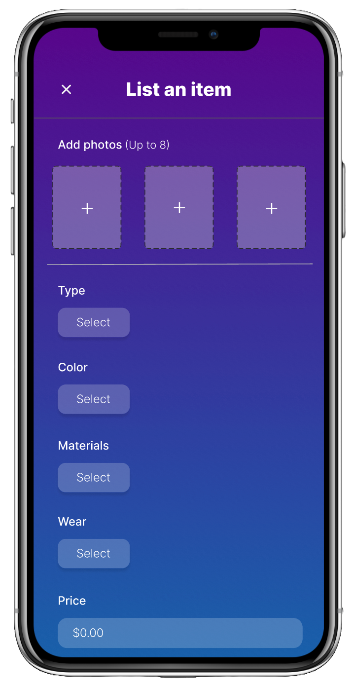
2. Guided but Lightweight Listing
Listing uses structured attributes (type, material, wear, price) while keeping the UI photo-forward. This is a deliberate tradeoff: structured inputs improve consistency and browsing later, while fewer required decisions reduce seller friction.
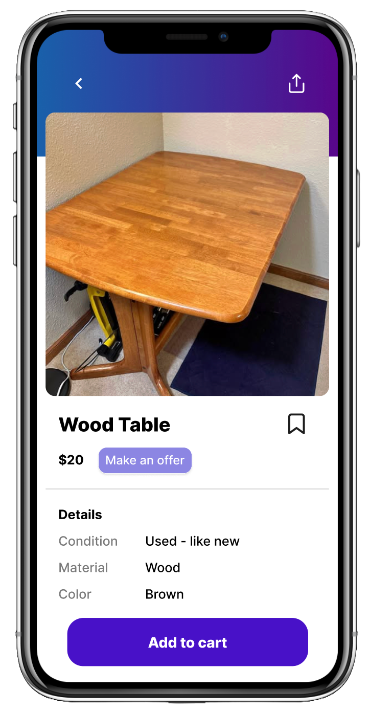
3. Browsing Designed for Exploration
The browse experience prioritizes visual scanning and category-based exploration rather than a search-first workflow. Students often browse furniture casually (between classes or while planning moves), so the design supports discovery.
4. Contextual Logistics (Not Front-and-Center)
Delivery and storage options are introduced only when relevant (during listing or checkout), rather than positioned as the core value proposition. This follows a progressive disclosure approach: advanced features should feel available, not required.
Branding & Visual Direction
I chose a restrained gradient palette and simple typography to balance approachability with credibility. The visual system was designed to support clarity and reduce friction, not compete with content.
- Student-friendly, not scrappy
- Trustworthy without feeling corporate
- Clean hierarchy that keeps attention on listings and photos
Outcome
The final prototype communicates a cohesive end-to-end flow:
- Verified onboarding
- Clear, structured listing flow
- Visual-first browsing
- Focused item detail views
- Optional logistics support
While conceptual, the process emphasized realistic constraints and tradeoffs that a real marketplace product would face.
Reflections
This project reinforced the importance of designing systems, not just screens — and using structure as a tool for clarity, not control. It shifted my thinking from “what features can we add?” to “what decisions are users being asked to make, and how can we make those decisions easier?”
If I Had More Time
- Test the listing flow with students to validate which fields feel essential vs. annoying
- Refine how delivery/storage eligibility is communicated (clear, optional, non-salesy)
- Add trust signals on listings (campus proximity, seller history, verification badges)