Green Bean Online Order Site
Designing a fast, low-friction ordering experience for a student-run campus café.
Role
Product Designer
Timeline
2 weeks
Team
3 designers


Challenge
The Green Bean is a student-run coffee lounge on campus with high foot traffic and long lines during peak hours. Long lines and only one register make the experience of ordering and waiting for a coffee extremely inefficient.
Our goal was to design an online ordering platform that allowed students to order drinks in advance, see wait times, and reduce congestion at the register — without disrupting the Green Bean’s identity as a community-focused space.
How might we...
- ...develop a system that makes peak-hour lines less frustrating and more efficient?
- ...build a platform that makes menu exploration easier and more joyful?
- ...create a solution that feels neither overly complex nor impersonal?
Qualitative Outcomes
- The final prototype demonstrates a streamlined ordering experience
- Allows students to order ahead and skip long lines
- Reduces pressure on staff during peak hours
- Keeps the experience aligned with the Green Bean’s campus identity
Early Mapping & Concept Development

Research & Inspiration
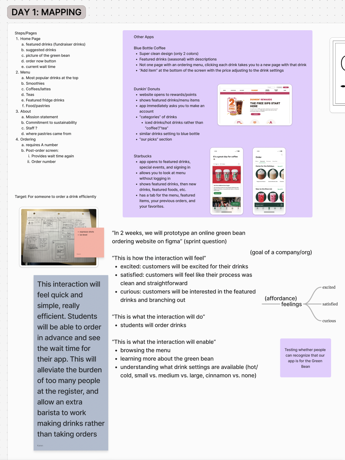
As a group, we analyzed existing ordering flows from platforms like Starbucks, Dunkin’, and Blue Bottle to understand how large systems handle speed, customization, and visual clarity.
We paid particular attention to:
- How featured drinks are surfaced to reduce decision fatigue
- How customization options are revealed progressively
- How users hesitate or abandon the flow
Process
We began with collaborative mapping sessions to define goals, constraints, and desired user feelings. Rather than jumping straight into screens, we focused on aligning around what the interaction should feel like.
- Mapped the ideal ordering flow from entry to pickup
- Defined emotional goals: quick, simple, efficient, satisfying
- Sketched low-fidelity flows before moving into Figma
- Iterated on layouts to reduce steps and unnecessary choices
Key Design Decisions
1. Speed Over Novelty
We prioritized efficiency over visual experimentation. The interface is clean, predictable, and optimized for repeat use — reflecting the reality that many users would order the same drink regularly.
2. Featured & Suggested Drinks
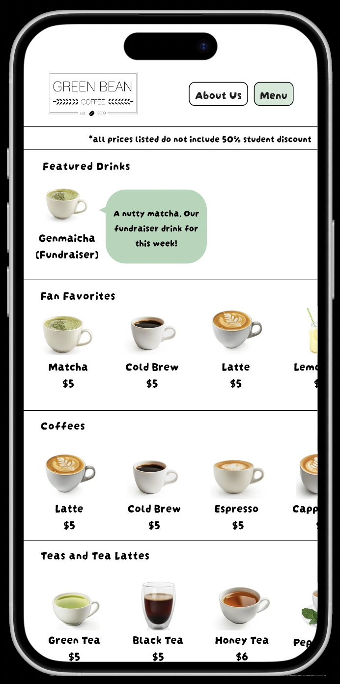
Highlighting featured drinks helps first-time users make decisions quickly, while encouraging returning users to explore beyond their usual order.
3. Progressive Customization
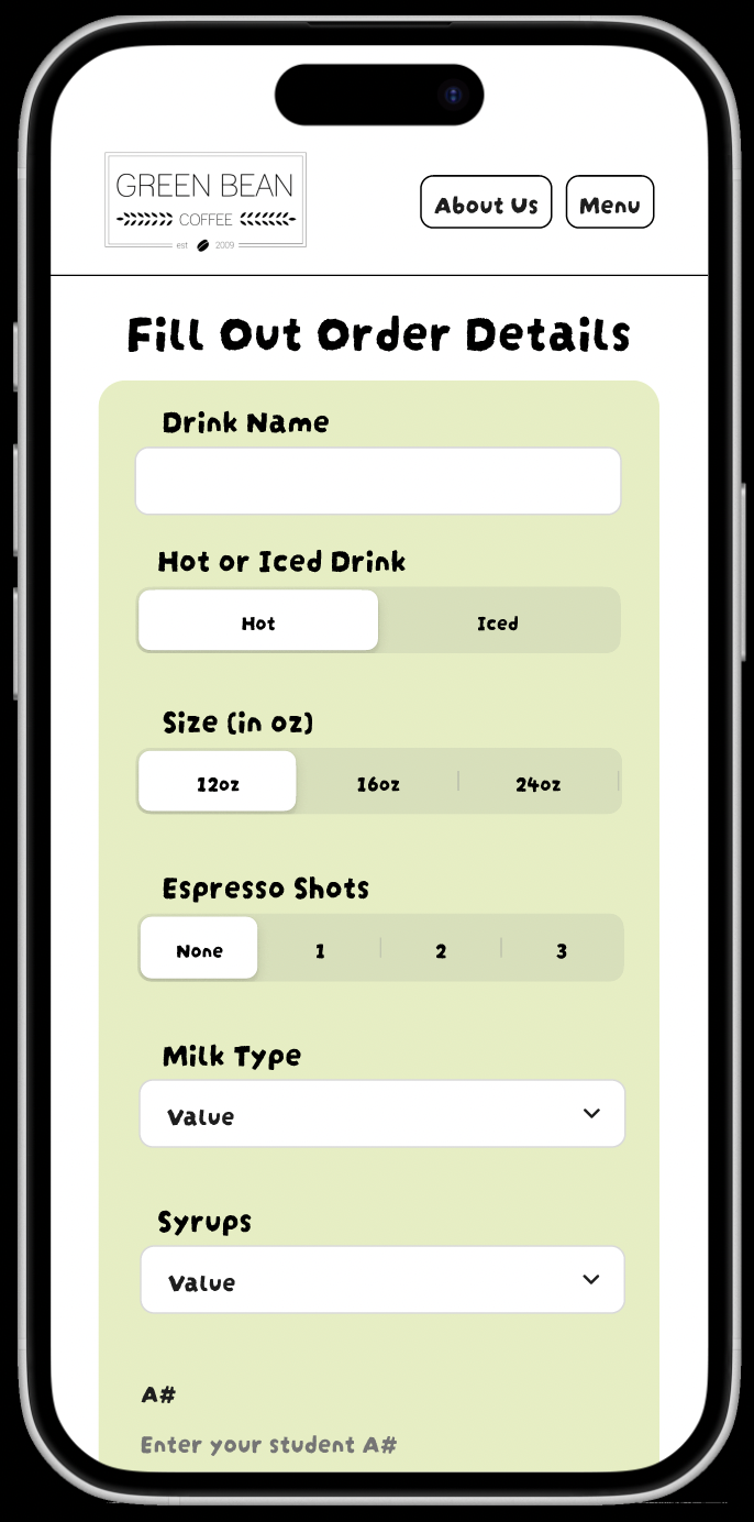
Drink customization options (size, temperature, add-ins) are revealed only when relevant, reducing cognitive load and speeding up the main flow.
4. Wait-Time Transparency
Showing estimated wait times helps users decide when to order and sets clear expectations, reducing frustration at pickup.
User Testing & Iteration
We conducted informal usability testing with students to evaluate clarity, speed, and ease of use. Testing surfaced moments of hesitation around drink customization and navigation between categories.
Based on feedback, we simplified language, reduced the number of visible options at once, and clarified call-to-action buttons.
Reflection
This project emphasized the importance of aligning interaction design with real operational constraints. Working in a group also highlighted how early alignment on goals and user experience can make later design decisions more focused and defensible.